
Coreply
Let the AI Think. Let the Agent Lead.
Designing Coreply an AI-enhanced support dashboard that helps agents respond faster with trustworthy, context-aware suggestions.
Timeline
May 2025 - August 2025
Platform
Desktop
Overview
Coreply is an AI-powered support dashboard built to help customer service agents respond faster and more accurately.
It combines smart reply suggestions, auto-generated customer summaries, and a streamlined resolution form — all in one focused workspace.
Designed with clarity, speed, and trust in mind, Coreply transforms traditional support tools into intuitive AI co-pilots.
The why
Support is stuck.
Agents lose precious time rewriting replies and jumping across tabs to find context. Existing dashboards are cluttered, slow, and built for backends — not people.
The solve
AI that assists, not replaces.
Coreply brings together smart reply suggestions, instant customer insights, and a streamlined resolution flow — all within one clean, assistive workspace that never takes over, only helps.
The impact
Faster replies. Smarter workflows. Happier agents.
Coreply transforms AI from novelty to necessity reducing response time, improving consistency, and making customer support feel like a conversation again.
My Role & Approach
I led the full design process — from defining the user problem, to mapping workflows, prototyping interactions, and designing the final UI.
My goal was to design with real support behavior in mind — not just what the tools do, but how people work under pressure.
Research & Discovery
Understanding the Problem
Since this was a self-initiated project, I didn’t have access to live support agents — but I still wanted to ground my design in reality.
I started by analyzing job postings, support tool reviews, UX case studies, and YouTube videos from actual customer support agents.
My goal was to understand not just what they do, but how they think and feel during a busy shift.
From this, I mapped patterns across 3 key areas:

Common responsibilities
Most agents handle 2–4 chats at once while juggling internal tools, macros, and forms. They’re expected to respond quickly and accurately — under pressure.
Workflow constraints
They work within strict SLAs (Service Level Agreements), often without time to personalize replies or double-check info — which leads to errors and burnout.

Frustrations
Agents often rewrite the same answers, hunt for context in multiple tabs, and rely on outdated macros that feel robotic. AI suggestions feel impersonal or unreliable.
I then distilled these insights into a focused persona:
Emily Reyes — Tier 1 Agent, juggling multiple chats, aiming for speed, and craving tools that feel like true assistants, not barriers.
This persona guided every design decision from the layout of the reply panel to the tone of the AI suggestions.

Emily Reyes
Tier 1 Customer Support Agent | 26 | 2 years in a hybrid support center
"I just want to get through my queue faster without sounding robotic"
Goals
Respond to Customers Faster
Understand the Customer’s Context Quickly
Avoid Mistakes While Multitasking
Stay On Top of Her Queue
Feel in Control of the AI
Frustrations
Repetitive tickets
Switching tabs for context
High response time pressure
Competative Analysis
Existing tools are fast but not agent-first.
Before designing Coreply, I explored platforms like Zendesk, Intercom, and Freshdesk to understand how AI is currently integrated into support tools. While these platforms offer powerful automation and macros, most of them fall short in supporting real-time agent thinking, clarity, and trust.
I wanted to understand what worked, what didn’t, and where Coreply could stand out as a better co-pilot for human agents.

Insight 1
Dashboards are system-oriented not agent-first
Most tools are built around backend logic and ticket management — not the agent’s mental model. Agents end up switching tabs and guessing where to find relevant info.
Insight 3
Automation ≠ real assistance
Macros and auto-responses help with speed, but they aren’t flexible. They don’t adapt to tone, intent, or the nuances of live conversations — making agents sound robotic.

Insight 2
AI suggestions lack transparency
AI replies often appear without clear context or explanation. Agents don’t know where suggestions come from or whether they can trust them — leading to confusion or rejection.
Insight 4
Cognitive overload is rarely addressed
Agents juggle 3–4 chats at once, but existing UIs are cluttered, text-heavy, and poorly prioritized. Important tasks compete for attention, increasing errors and stress.
Define
Combining the above insights into four high-level goals
Based on user research, competitive analysis, and support agent workflows, I outlined four design goals to shape the experience of Coreply:

Goal 1
Reduce cognitive load
Design a focused, clutter-free interface where agents can access everything they need — without switching tabs or losing context.

Goal 2
Build trust in AI
Ensure suggestions are clearly sourced, editable, and never auto-sent — giving agents confidence and control in every interaction.

Goal 3
Keep replies flexible, not robotic
Let agents personalize AI-suggested responses with ease — preserving their tone while still saving time.

Goal 4
Support real-time workflows
Design for speed and responsiveness — enabling agents to resolve issues faster while maintaining clarity under pressure.
Ideate
Exploring Layouts That Empower Support Agents
To structure the dashboard in a way that supports real-time decision-making and minimizes cognitive load, I explored 3 distinct layout directions. I mapped the pros and cons of each and ultimately chose the one that balanced clarity, speed, and familiarity.
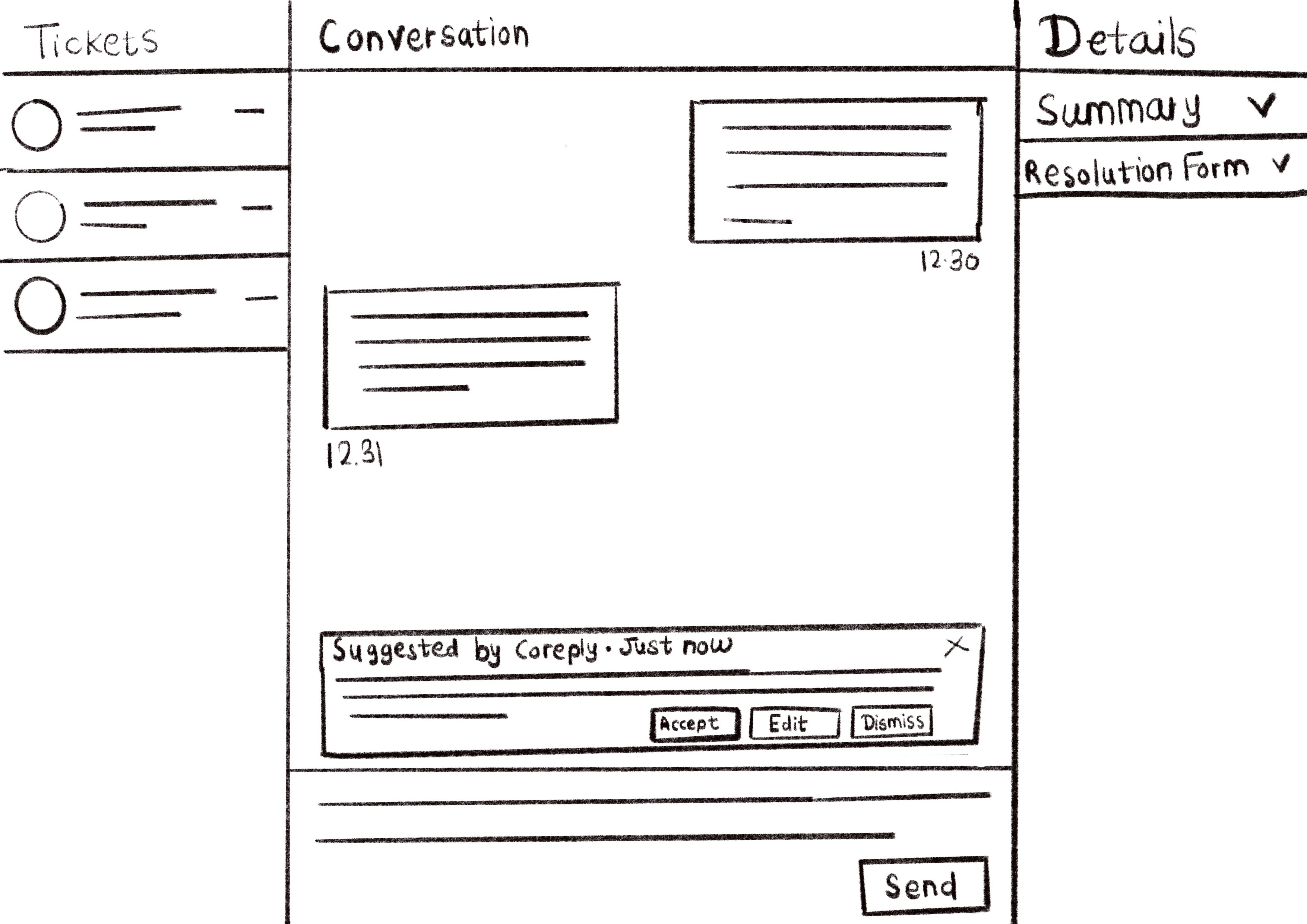
Classic 3-Panel
This layout balanced usability and information density best. It gave agents full visibility without extra interaction cost — ideal for fast-paced environments.

Familiar to agents (low learning curve)
All key areas visible: Chat / Suggestions / Context
No hidden layers

Can get crowded on smaller screens
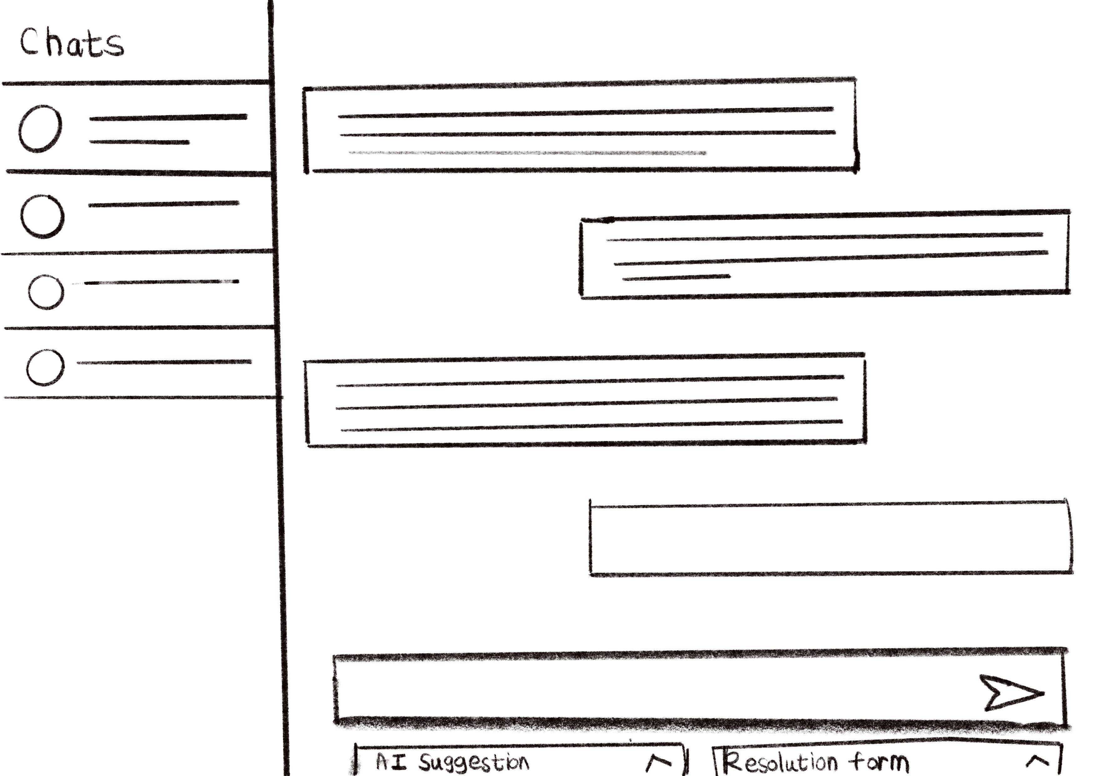
Bottom Drawer Interaction
Too hidden for a workflow that relies on constant AI guidance.
Clean vertical flow (great for mobile)
AI + Resolution tools stay “off-canvas”
Adds an extra step to reveal tools
Poor for persistent AI visibility
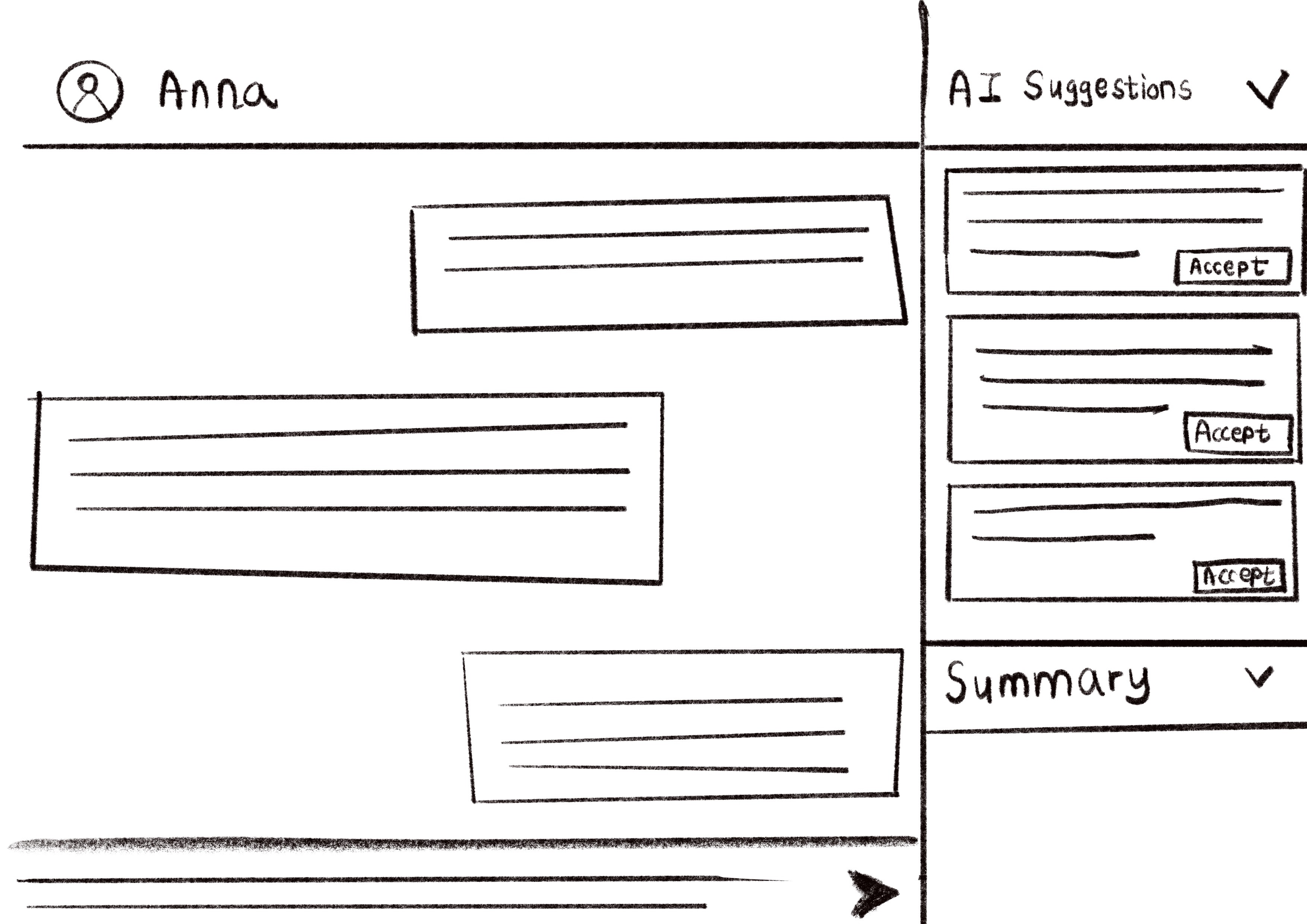
Side-by-Side Split View
Visually clear, but the fixed split reduced flexibility when managing multiple threads at once.
Highlights the conversation
Contextual stack of AI suggestions + resolution form
Supports agent thinking flow
Slightly harder to scale across screen sizes